Forty 45
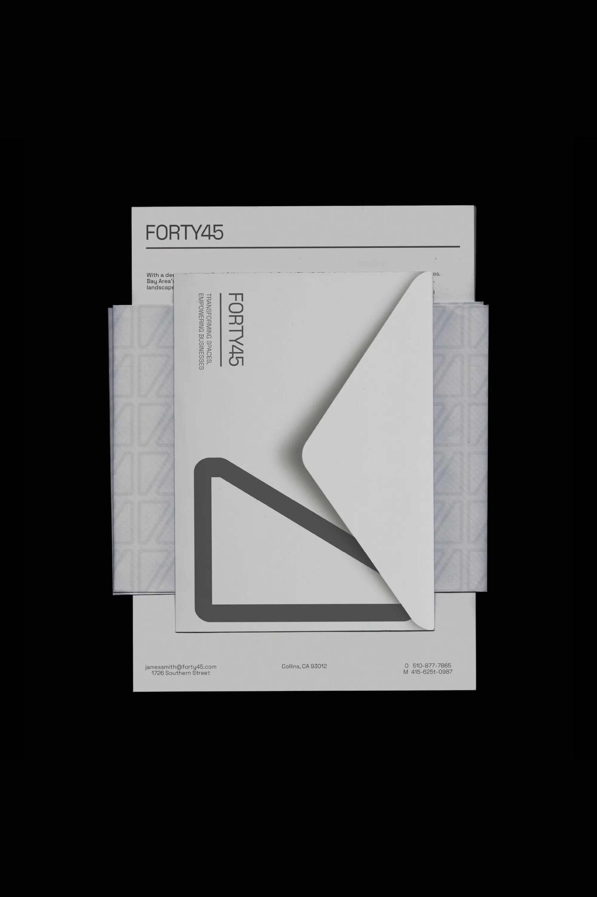
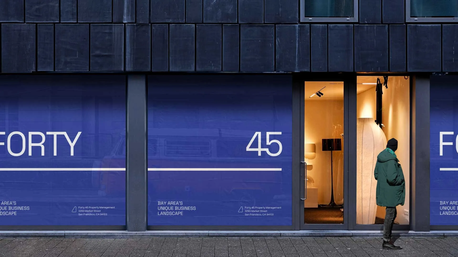
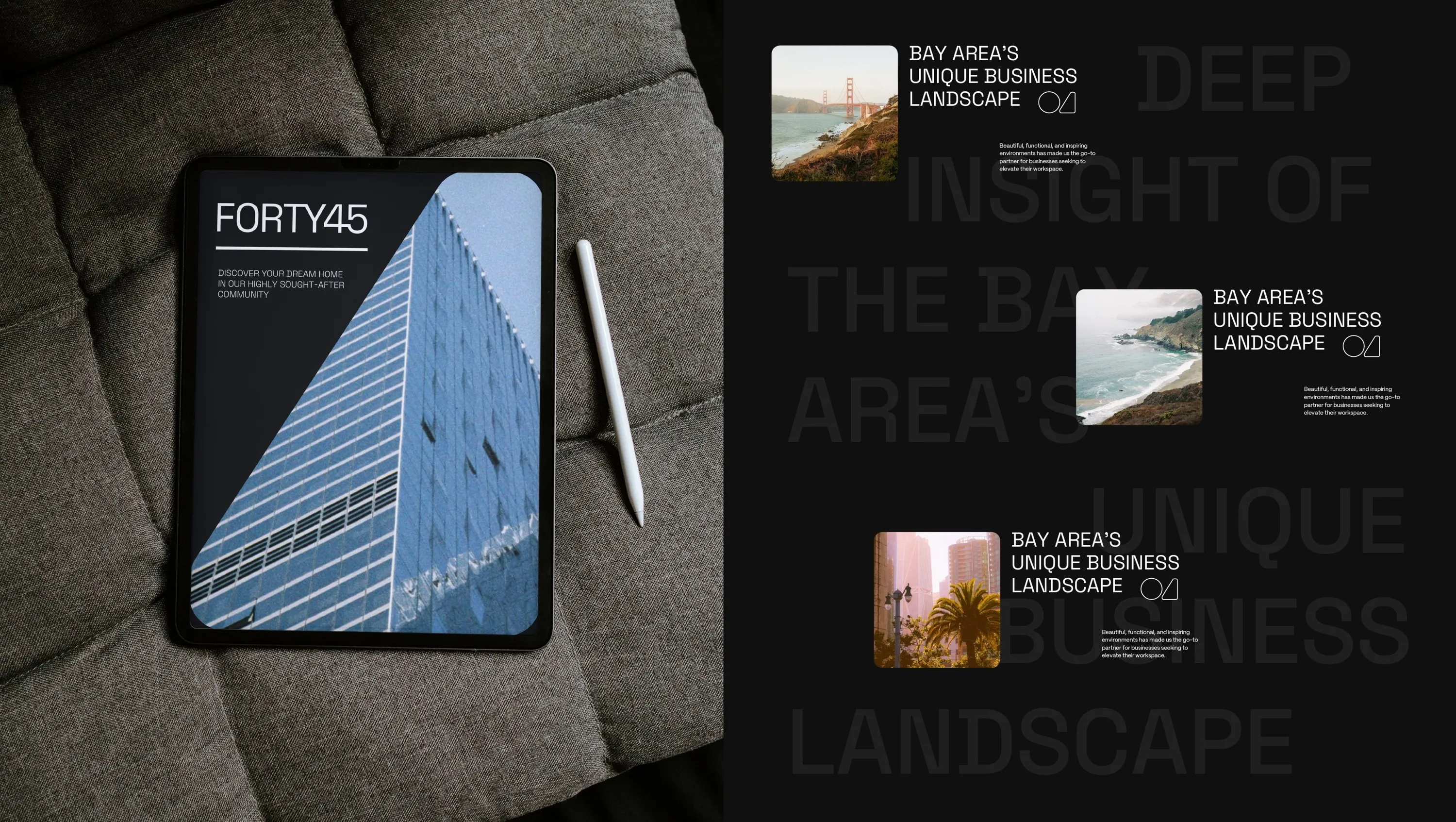
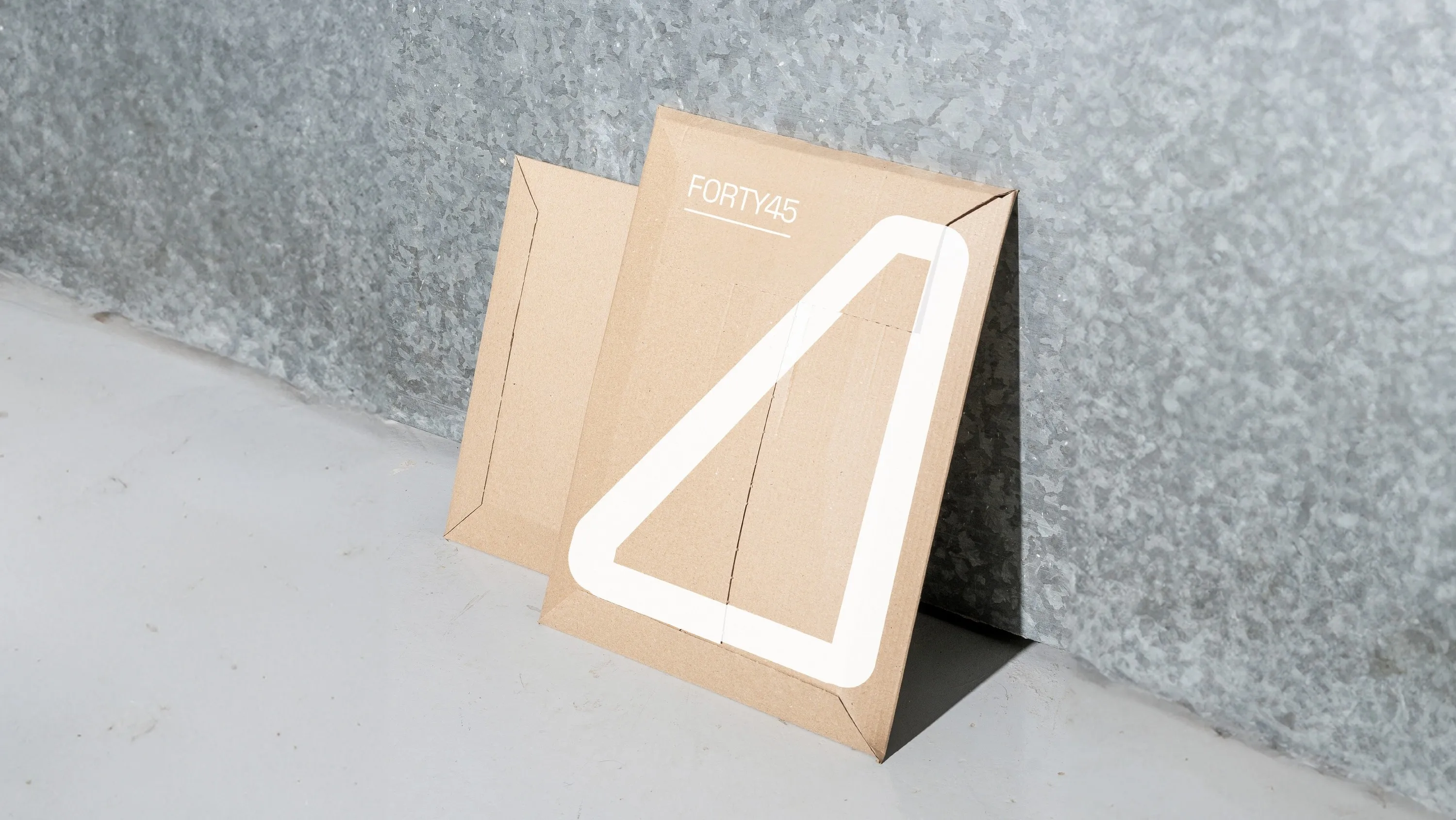
Forty 45 needed a branding overhaul to better represent their role as a transformative force in commercial real estate. The goal was to create a brand identity that reflects their commitment to providing beautiful, functional, and inspiring spaces. This involved updating their visual and verbal communication to resonate with their current clientele.
Process
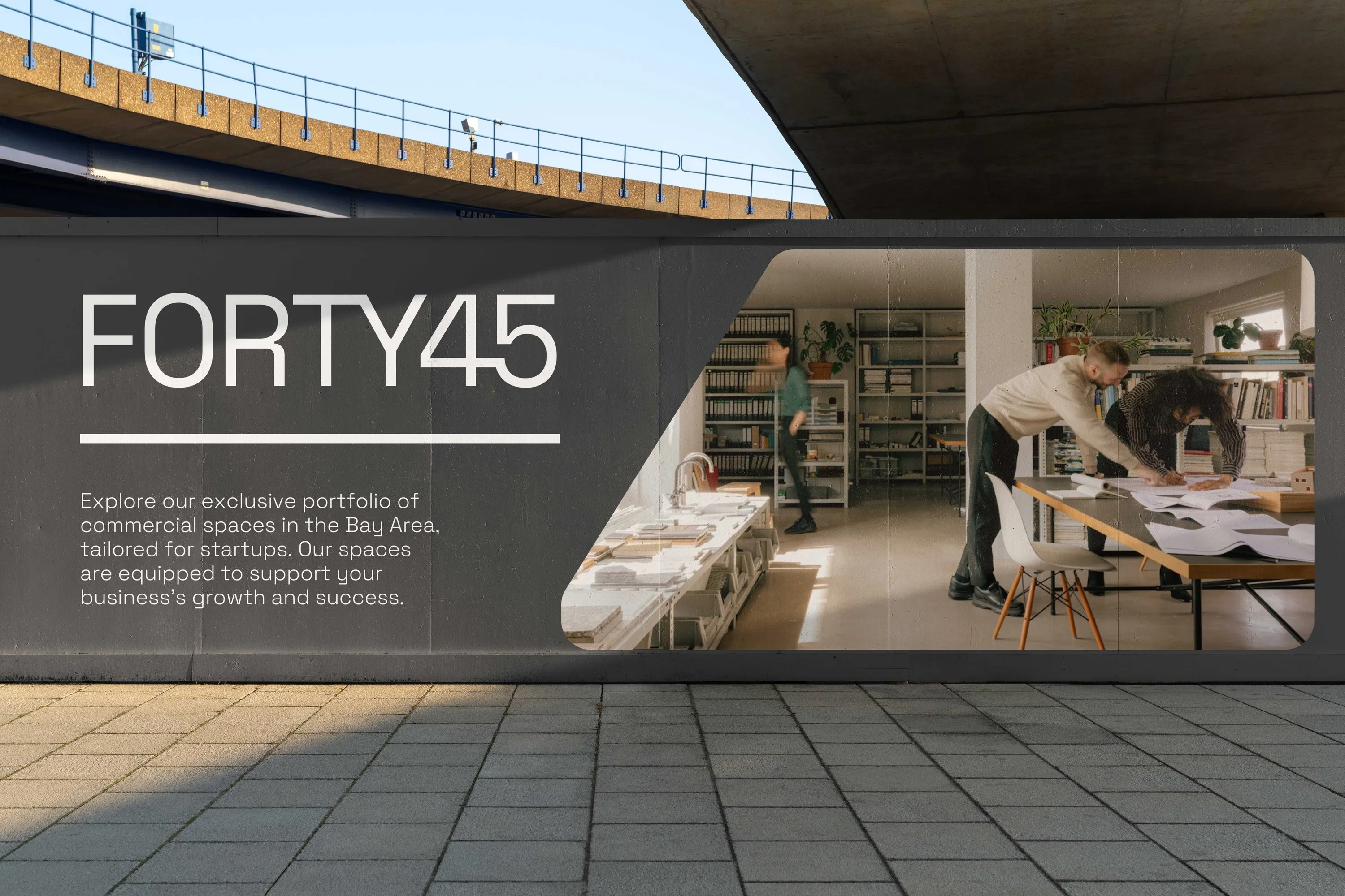
The design process involved creating a modern logo, icon, and color palette, as well as refining their messaging and layout. This comprehensive update aimed to align their visual and verbal communication with their commitment to creating inspiring and functional spaces, enhancing their connection with clients.
Services
Branding